FREE Standard Shipping on Orders $69+ with code:
FREESHIPPING


Cheers
Be the first to cheer this project!
Give a Cheer
Be the first to cheer this project!

 Give a Cheer
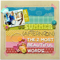
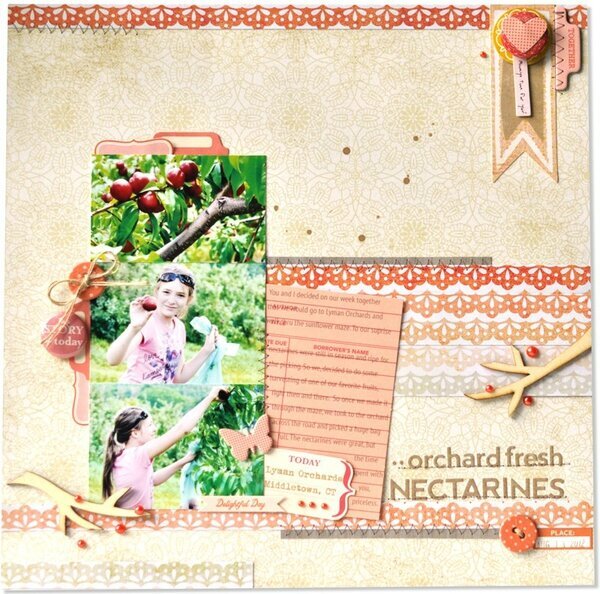
Hi Peas! For this page I too several elements from multiple collections including The Sweetest Thing from My Mind's Eye, Paper Cottage from Basic Grey, and Woodland Park from October Afternoon to really play up the pink-orange colors that I was trying to evoke for the subject of my layout, nectarines. Sometimes, it's necessary to draw from several manufacturers' collections to achieve the feel that you want for a page. I really wanted to play up the ombre effect that I was able to achieve from the My Mind's eye lace paper, but wanted all the elements to feel soft, yet eye catching at the same time. The addition of the kraft, and natural wood, lends an organic feel along with grounding the color from being too saturated. I talk a lot about this type of color achieving in my color theory workshop here at Two Peas. I've linked it up below for your convenience. Thanks so much for looking! ;)
No products have been added to this project.

Thanks for spreading positivity!