Livestream Party!
Join us today at 9:00am PT / 12:00pm ET | Details Here.
Join us today at 9:00am PT / 12:00pm ET | Details Here.

 Give a Cheer
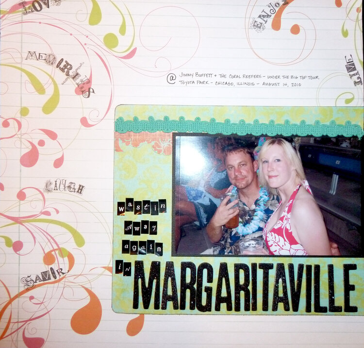
My boyfriend and me at the Jimmy Buffett concert in Chicago, August 2010.
No products have been added to this project.


Thanks for spreading positivity!


July 22, 2011
December 24, 2010
November 27, 2010
November 24, 2010
November 24, 2010
November 22, 2010
November 21, 2010