Thank YOU! It's Customer Appreciation Week!
EXTRA 11% OFF Orders $100+ With Code: THANKYOU
EXTRA 11% OFF Orders $100+ With Code: THANKYOU

 Give a Cheer
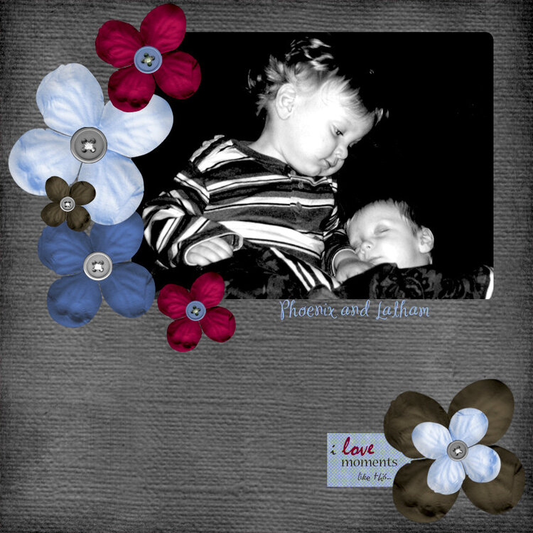
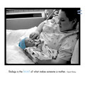
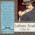
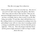
This is the 1st page to a LO I did for my two sons, Phoenix and Latham. TFL and please take a look at my 2nd page as well.
No products have been added to this project.

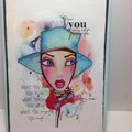
Thanks for spreading positivity!


September 07, 2006
August 15, 2006
August 14, 2006
August 10, 2006
August 07, 2006
August 06, 2006
August 05, 2006
August 05, 2006
August 04, 2006
August 04, 2006
August 04, 2006
August 04, 2006
August 04, 2006
August 04, 2006
August 04, 2006
August 03, 2006
August 03, 2006
August 03, 2006