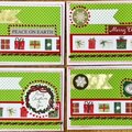
Thank YOU! It's Customer Appreciation Week!
EXTRA 11% OFF Orders $100+ With Code: THANKYOU
EXTRA 11% OFF Orders $100+ With Code: THANKYOU

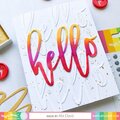
 Give a Cheer
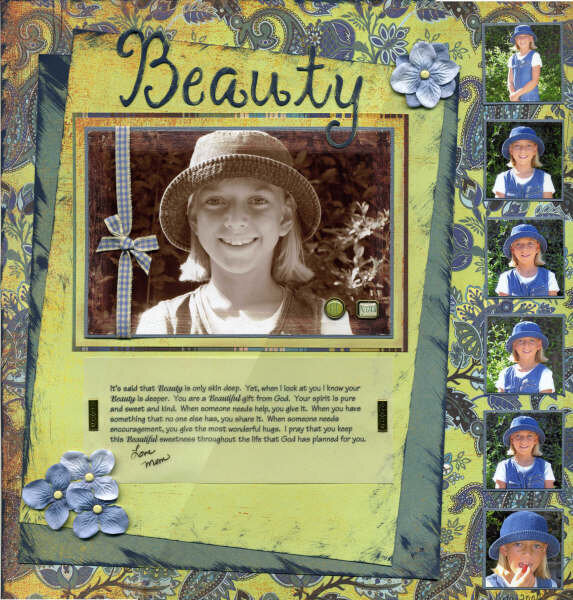
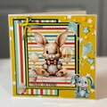
I originally intended to enter this in the $20,000 contest, but I never got around to making two additional layouts to enter. The picture is of our daughter right before she got braces. I was so happy with the way the picture turned out I had to do a special layout for it.
I printed the focal picture in sepia tones (first time I've ever done that) and sanded the edges of the photo. The paper is Basic Grey Skate Shoppe in the following patterns: Indy Grab, Myrtle, Dill and K-Stall. I also threw in a little light blue Bazzil paper. The ribbon is from KI Memories, the metal brads on the picture (that say Be You) are from Studio K. The rest is stuff I had around. I cut chipboard with my Sizzix for the title then painted it to match.
No products have been added to this project.
Thanks for spreading positivity!


April 22, 2006
April 21, 2006
April 20, 2006
April 19, 2006
April 18, 2006
April 18, 2006
April 18, 2006
April 17, 2006