DCG8: I think it's just beautiful. I'm new to digi so can't offer any technical suggestions. Love the wordart. Visually, I would like to see a heavier font in the journaling for easier reading but I like the white (light)font color. So pretty.
I love the word art, but if you hadn't mentioned the hands I would have missed it. I would say if you want you can just put the background into it's own block panel to show it off. Need more contrast, a stroke or heavier font for the bulk of the journaling.
If you don't have curves in PSE5, download one of the curve tools for elements and add it in. I can allow you to lighten up the eyes enough to show the color in all likely hood, plus you might increase the saturation 15-20% to bring out more color.
I think the journaling would work ok if you could lower the opacity on the background paper. You would still have the background paper there but not covered up. If you don't want to do that you could maybe change the color of the font to show up better. Other than that I love the layout it is Awesome and inspiring!!!
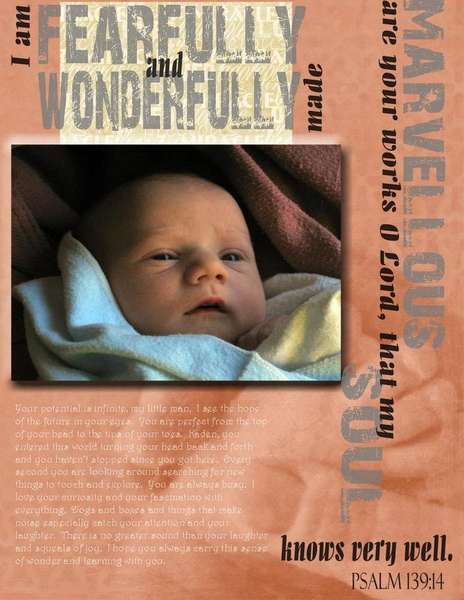
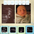
I used Misty Cato's Adorable to do this. I love this photo even if it is a little grainy and his eyes are dark in it. In real life his eyes are very blue and not dark at all. Please give suggestions. I guess most of all I need suggestions for the journaling. I think it looks kind of lame to just type on the page(not always...but in this case it does...). But at the same time I don't want to cover up the background paper because I love those hands! so suggestions please...
Does this project or one of it's images contain pornography, profanity, or other illegal or offensive material? If so, please report it and our moderators will come by and clean it up in a flash.
October 17, 2006
October 16, 2006
October 15, 2006
October 15, 2006