


FREE Standard Shipping on Orders $69+ with code:
FREESHIPPING
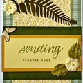
 Give a Cheer
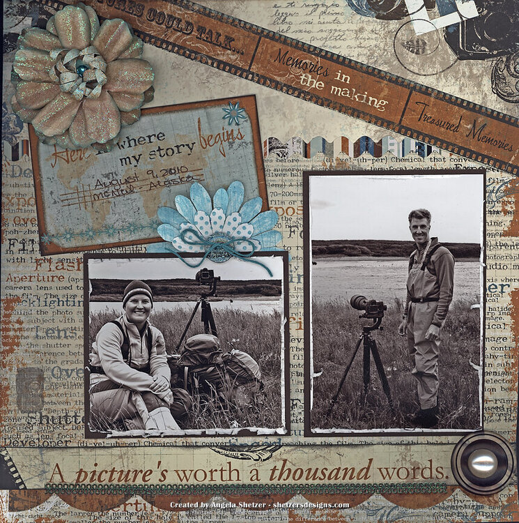
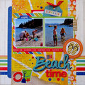
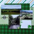
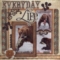
August 9, 2010 - A picture's worth a thousand words - McNeil River Sanctuary, Alaska
Journaling: None
Supplies Used:
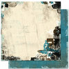
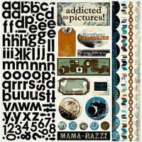
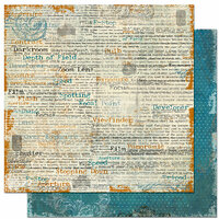
Bo Bunny - Mama Razzi patterned paper
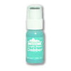
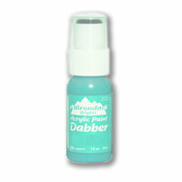
Ranger - Adirondack Dabber - Aqua paint
Tim Holtz Distress Ink - Broken China
Cloud 9 - Cocoa Mint stickers/rubons
Zutter Distress it all
Stampin Up stamps - Dot, Dot, Dot & Sanded
Ranger Archival ink - Sepia
EK Success - punch
BasicGrey - The Details stamp
Misc - button, fiberts, sharpie, black ink
Technique Tip: I originally turned the photos of us into sepia because we really clashed. I had on bright pink waders and a blue fleece and he has on a yellow fleece so I could not get the photos to work together. Once I had them printed, I decided that I really wanted to go with a vintage look. First I matted the photos with a dark brown cardstock to make them stand out and then had to find an accent color so my layout wasn't all brown. I took a couple of white flowers and painted and stamped them with Aqua/teal. The flower in the top left was made when my sister visited and we spent an afternoon just making flowers for future use. Its great to have a stash!!


Thanks for spreading positivity!


November 07, 2012
September 27, 2012
September 27, 2012
September 27, 2012
September 27, 2012
September 27, 2012