

Storage & Organization up to 60% OFF!
Plus, a FREE Gift! | Details Here.
Plus, a FREE Gift! | Details Here.


 Give a Cheer
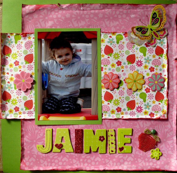
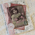
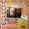
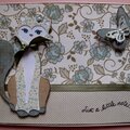
This is one of my favorite pictures of my daughter, Jaimie. She was only four years old here and I used to LOVE to dress her up in all the adorable Gymboree collections! In this picture she has on a jacket from their "Strawberry Fields" collection. I wanted to incorporate the strawberry theme in the layout.
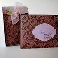
First, let me say that I am just learning and I wanted to try some new "techniques" that I have seen done with the rough and inked edges. That being said ... I don't think I'm very happy with it in the end. The first glaring mistake is that the strawberry paper is upside-down :( I was putting this together around 1 a.m. but even so .. when I noticed the mistake I was pretty disappointed!
Beyond that .. as I said, I wanted to try the rough edges with ink .. I don't like how you can see creases in paper around the edges of the pink paper ..
When I woke up this morning it hit me that the rough edges/ink look probably looks much better on paper with soft romantic lines .. not crisp white paper .. does that make sense?
Well, I would appreciate your feedback very much so that I find ways to improve ..
Thanks so much for your encouragement and inspiration!
*hugs*
Kimberly


Thanks for spreading positivity!


February 22, 2011
February 22, 2011
February 22, 2011
February 18, 2011