


FREE Standard Shipping on Orders $69+ with code:
FREESHIPPING


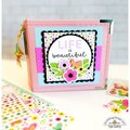
 Give a Cheer
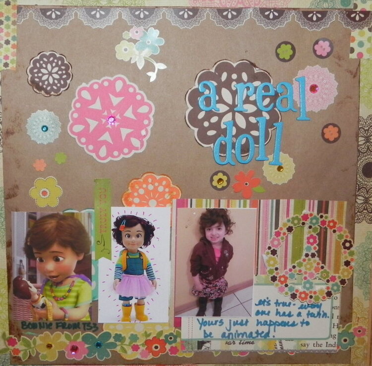
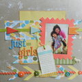
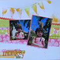
This is my Week #2 sketch - post Glossy Accents mishap! The photos tell a story -- I have had several people comment on how much Nina looks like Bonnie from Toy Story 3. I'd never seen the movie, so I googled Bonnie and found her in both cartoon and doll form. I think it's an unreal likeness. Because the photos told a story, I decided to go with a straight-across layout of the pics, rather than the sketch version.
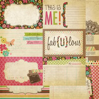
The Glossy Accents mishap was in the lower righthand corner. I had the perfect title card from the SS line that said "This is ME". I ran the Glossy Accents over the "ME", and not only did it not stay in place, but I accidentally set something on top of it -- GAH!! So I had to rip that off and just put the striped paper and the peace sign in its place.
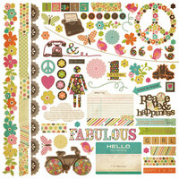
The circles were colored to match the colors in Simple Stories Fab-U-Lous line, and print/cut with my Silhouette. I doodled on the middle photo. IRL, the kraft paper is centered on top of the PP and inked, but it looks really messy in the photo.
So that's my story, lol!


Thanks for spreading positivity!


August 30, 2012
August 27, 2012
August 24, 2012
August 24, 2012
August 21, 2012
August 19, 2012
August 18, 2012
August 17, 2012
August 17, 2012
August 17, 2012
August 17, 2012
August 16, 2012
August 16, 2012
August 16, 2012
August 16, 2012
August 16, 2012
August 16, 2012
August 16, 2012
August 16, 2012
August 16, 2012
August 16, 2012
August 16, 2012
August 16, 2012
August 16, 2012
August 16, 2012
August 16, 2012