


Thank YOU! It's Customer Appreciation Week!
EXTRA 11% OFF Orders $100+ With Code: THANKYOU
EXTRA 11% OFF Orders $100+ With Code: THANKYOU

 Give a Cheer
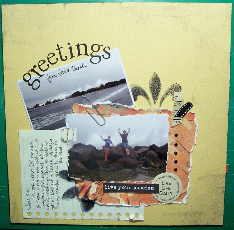
I used this title because I thought this picture looked like a postcard! journaling reads..."We took about 25 pictures of these rocks in an attempt to capture this moment of the waves crashing. Once we finally got it, Nathan and Sarah decided they needed one with them in the shot." thanks for looking :)---------------I have since added a quote to this page. I was reading Pablo Neruda the other night and found a line that I thought fit perfectly. "Pardon me if, to my eyes, nothing is clearer than sea spray" I love him. plan on seeing more by him on my pages! :)


Thanks for spreading positivity!


June 26, 2007
June 25, 2007
June 25, 2007
June 25, 2007
June 24, 2007
June 24, 2007
June 24, 2007