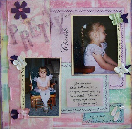
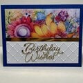
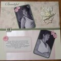
Pretty papers you used!!! Of course sweet picture's!! And the title is great but maybe try darkening it down??? See if it pops more other wise i think the lo looks AWESOME! :)
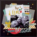
WOW! This is a pretty LO! The title looks a little out of place since it's so light colored compared to the colors of the journaling. Maybe ink around the edges to give it more definition, IMHO. I think you ladies are changing my mind about pink!
Great job on the stitching, and the colors are beautiful. I think maybe it doesn't "pop" to you because the title is not dark? Just a thought. I really like it, though! Good work!
Does this project or one of it's images contain pornography, profanity, or other illegal or offensive material? If so, please report it and our moderators will come by and clean it up in a flash.
 Give a Cheer


April 06, 2007
April 05, 2006
March 31, 2006
March 31, 2006
March 31, 2006
March 31, 2006
March 31, 2006
March 30, 2006
March 30, 2006
March 30, 2006
March 30, 2006
March 30, 2006
March 30, 2006
March 30, 2006
March 30, 2006
March 30, 2006