I like this page. The picture is sweet and well placed. The frame is very nice. The rub on is nice and the embellishments are a nice touch. Of you don't love it, it may be the weight of the journaling. Try adding something to the top - a title of sorts to balance it. Or slide the pic to toward the bottom left (not all the way) and journal down the right side?
CHT: Since your page is white and the pic B&W, I feel you are missing some color (ar al least something bold) to draw the attention to the page (I wonder what the page would look like on a black background and with white journaling??). I like the journaling at the bottom, but the lines of the text are a bit too long (i'd line up the text with the mat YKWIM??).
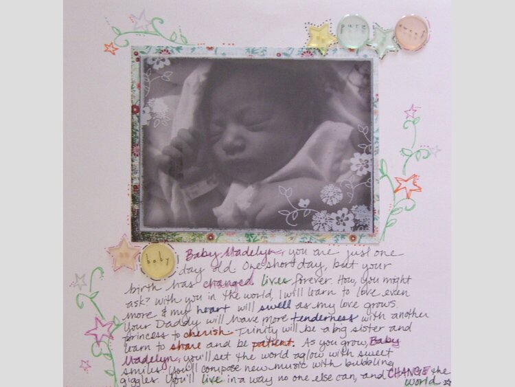
I lifted the idea off of a formula ad I recently saw...not sure I'm that thrilled about it...maybe it's my journaling taking over the bottom of the page. I don't know yet. Any thoughts? I'm willing to do this one over.
Does this project or one of it's images contain pornography, profanity, or other illegal or offensive material? If so, please report it and our moderators will come by and clean it up in a flash.
May 16, 2007
March 30, 2007
March 26, 2007
March 16, 2007
March 12, 2007