Livestream Party!
Join us today at 9:00am PT / 12:00pm ET | Details Here.
Join us today at 9:00am PT / 12:00pm ET | Details Here.

 Give a Cheer
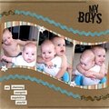
Made this kit and didn't have anything to scrap with it so used a pic from one of the weddings dh photograhed (that's why I've blurred her face.
No products have been added to this project.


Thanks for spreading positivity!


August 12, 2006
August 09, 2006
August 04, 2006
August 04, 2006