Thank YOU! It's Customer Appreciation Week!
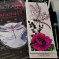
EXTRA 11% OFF Orders $100+ With Code: THANKYOU
EXTRA 11% OFF Orders $100+ With Code: THANKYOU

 Give a Cheer
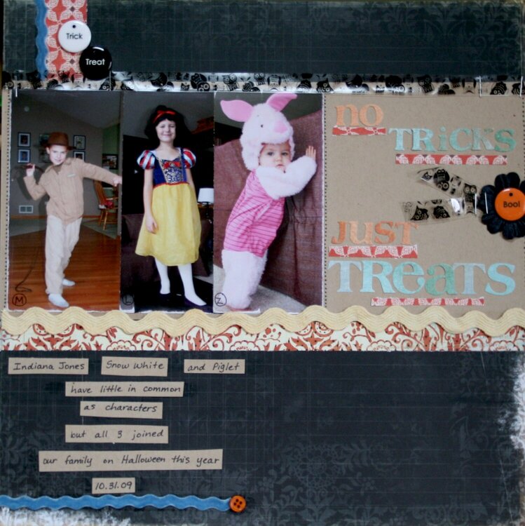
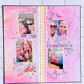
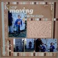
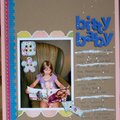
More Halloween with the three kids.
Made with a kit from the Mosey Scrapper
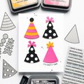
No products have been added to this project.
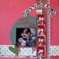
Thanks for spreading positivity!


February 06, 2010
December 02, 2009
November 27, 2009
November 25, 2009
November 24, 2009
November 23, 2009
November 23, 2009
November 23, 2009