I like this one much better than the original. I too would like to see "perfect" backed up to the journal line above. I would also like to see the block of photos moved to the left a bit nudging to overlap the journal block just a little bit. I like the bright colors.
DD: I hear you on the limitations...gotcha & dang that rasterize. I'm guilty of going the other way--saving 150 MB+ size PS files so that every little detail can be altered. Seriously, I love this so my thoughts were purely from the "if I could suggest something to change" critique perspective :)
I had rasterized the text layer and was too lazy to re-create it. I placed the frame under the title and off the page on purpose because I wanted a "drawn on" effect and when I nudged it down further, it covered up the bottom cherries, too much, which are part of the background (by that time). There are definite limitations when your background is such a component in your layout from the beginning.
I like *almost* everything about this. I personally like the bright yellow with the red--you need that to pop the blue in the shirt from the photos and the "scream for ice cream" calls out for a colour like this! I agree about the word "perfect". I'm impressed with your photo placement but I'm wondering if the whole frame could be nudged left & down, so that top right corner of it is not off the page and so it is close to but not on the 'r' in "cream". This would also overlap it more with the other frame around the text...I think that one move will make this layout rock!
I do like this one better although I thought the first was great too. I'm not sure why you have the space there on the word "perfect" but it does look out of place to me too.
This will be my first critique at Scrapbook.com so watch out. Like I said in my into post, I'm blunt and nothing I say is meant to offend...only to be constructive. So, here goes:
I think you need to move the word "perfect" up to the line above it, that looks a little odd to me. Time is capitalized, don't know if intentional or not. The pictures are great but I'm not sure the colors work for me. They look a little "cheese-ish". Maybe pastels would work best with ice cream? Or Neopalitan colors?
I just wish I could have seen the first original layout so I knew what to compare this too.
I hope it wasn't too harsh, but I joined the group to recieve the same kind of feedback from others.
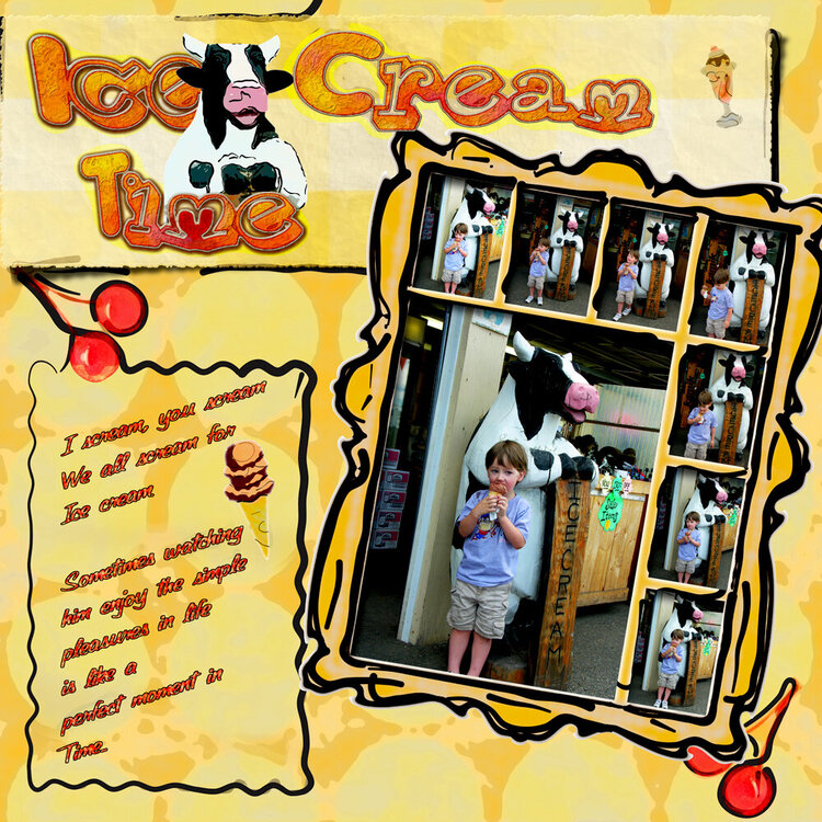
So I submitted a version before that met with lack luster enthusiasm, which is fine, because I didn't like it either. So I redid the whole thing. Different style, different colors. This should be more fun for everyone.
Does this project or one of it's images contain pornography, profanity, or other illegal or offensive material? If so, please report it and our moderators will come by and clean it up in a flash.
March 04, 2008
March 19, 2007
March 17, 2007
March 17, 2007
March 17, 2007
March 17, 2007
March 17, 2007
March 17, 2007
March 16, 2007