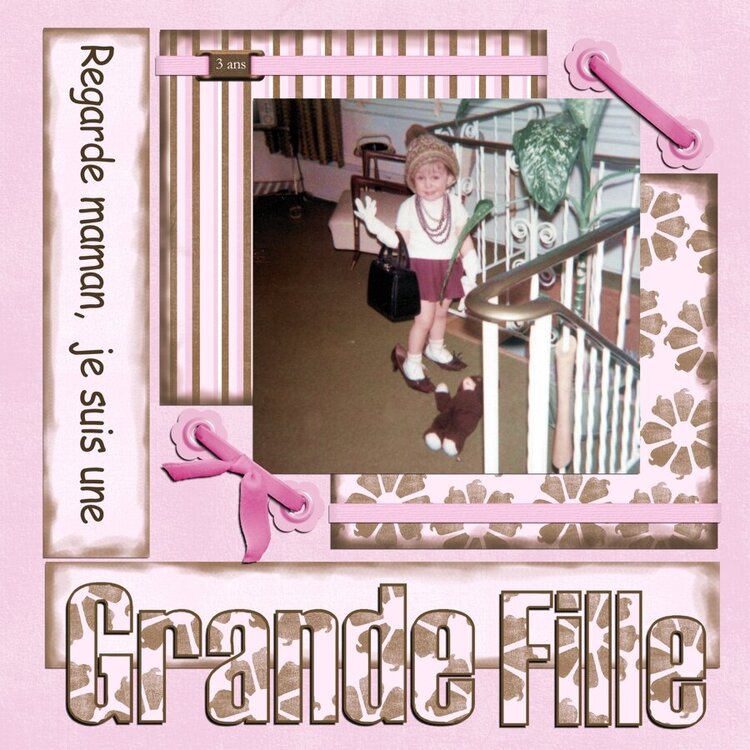
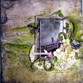
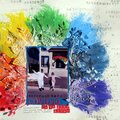
Nice LO. I like the inking on the background papers. I'd increase the drop shadows on the 3D elements like the laced eyelets and the big title to give them more depth like you would expect in a real paper layout and add a larger drop shadow on the "3 ans" element to give it an equivalent light source as the rest of the layout. 3D elements catch the light higher and cast longer shadows unless the light is directly downward on the surface, but since you have 3D elements you have to match their light source angles and it is coming from top right on all of these.
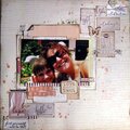
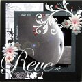
Thanks for the suggestiomn Mbarnes, however im not sure I see where you want the flower: Bottom pink ribbon (with the bow)on the left side would put it right on the photo... Is that right?
This is lovely! The only thing I might add would be a small brown flower on the right side of the bottom pink ribbon. I like how you used the flower background for the title. great job!
Does this project or one of it's images contain pornography, profanity, or other illegal or offensive material? If so, please report it and our moderators will come by and clean it up in a flash.


 Give a Cheer


September 01, 2010
August 07, 2010
July 12, 2010
November 01, 2006
October 30, 2006
October 27, 2006
October 25, 2006
October 23, 2006
September 08, 2006
September 06, 2006
April 10, 2006
March 26, 2006
March 22, 2006
March 21, 2006
March 20, 2006
March 18, 2006
March 18, 2006