Card Making up to 60% OFF
Plus, a FREE Gift! | Details Here.
Plus, a FREE Gift! | Details Here.


Be the first to cheer this project!

 Give a Cheer
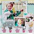
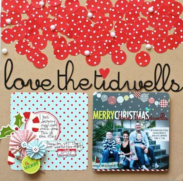
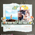
This is our 2010 Christmas Card. I already shared the card, but I wanted to do a layout for it too. To make the matching title I used the same font from the card and cut it with my Silhouette. I'm in punch mode right now because of the Products You Love Class. :) This is an example of using the same punch (1" circle) on the same sheet of paper and layering the punches together. More interesting than just cutting a strip of the paper for the top of the layout. But still not too overpowering for the photo. I glued in a few pearls as well.
No products have been added to this project.
Thanks for spreading positivity!