Storage & Organization up to 60% OFF!
Plus, a FREE Gift! | Details Here.
Plus, a FREE Gift! | Details Here.


Be the first to cheer this project!

 Give a Cheer
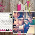
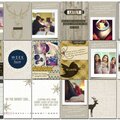
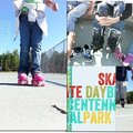
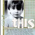
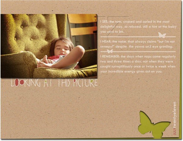
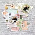
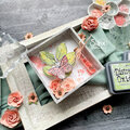
I'm a sucker for design and love the idea of considering design principals in a more thoughtful manner when creating layouts. For this first week, balance and unity, I've come up with these two layouts in response.For my first layout, I've balanced the photo out with a corresponding journaling block. As the text didn't carry quite as much visual weight as the photo, I added the butterfly accents and a bit more color to help complete the balanced look.For my second layout, I've created unity by sizing (and shaping with rounded corners) the photos identically as well as grouping them together so they appear to be a single unit within the design.
No products have been added to this project.
Thanks for spreading positivity!