Shop the Die Cutting Sale!
Take 10% OFF Orders $100 or More! Use Code: SMILE
Take 10% OFF Orders $100 or More! Use Code: SMILE
Be the first to cheer this project!

 Give a Cheer
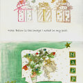
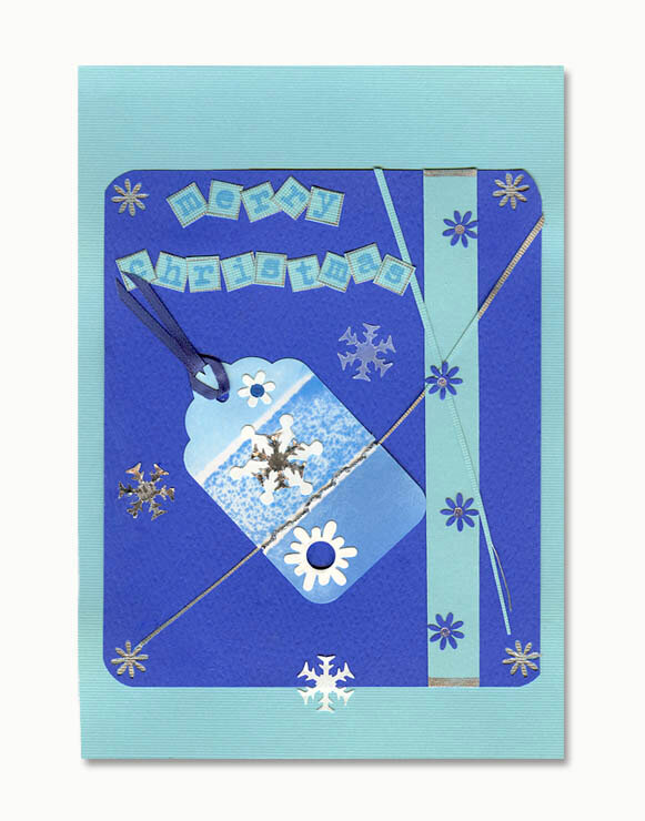
I tried to make the best out of a bad stamp on the card by making the uneven ink coverage seem intentional--like falling snow. I did okay with the letters but they're not as dark as I'd have liked. But it was the darkest blue ink I had and did match one of the inks on the tag.
No products have been added to this project.
Thanks for spreading positivity!

%20-%20Scrapbook.com)