


Memorial Day Weekend Savings!
FREE Standard Shipping on Orders $85+ with code: FREESHIPPING
FREE Standard Shipping on Orders $85+ with code: FREESHIPPING

 Give a Cheer
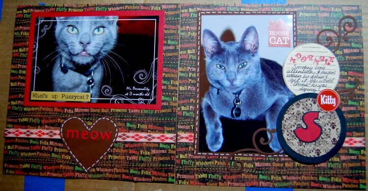
Smokey loves attention and meows when he doesn't get it. You would think he was dying!


Thanks for spreading positivity!


August 25, 2008
August 23, 2008
August 21, 2008
August 20, 2008
August 19, 2008
August 10, 2008
August 10, 2008
August 10, 2008
August 10, 2008
August 09, 2008
August 09, 2008
August 08, 2008
August 08, 2008
August 07, 2008