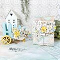
Shop the Die Cutting Sale!
Take 10% OFF Orders $100 or More! Use Code: SMILE
Take 10% OFF Orders $100 or More! Use Code: SMILE

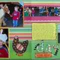
 Give a Cheer
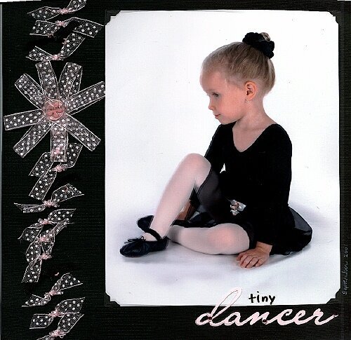
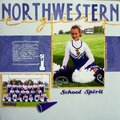
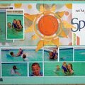
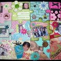
Since this is a professional photograph I do not want to permanenly adhere the photo to the page; therefore, I chose to attach it using small black photo corners.
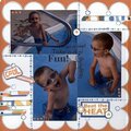
I am no really happy with this LO. Probably because it doesn't meet my expectation of how I thought it would look when I envisioned it. I like the title and the placement of the title, but am just not happy with the way the ribbon flower and ribbons came out. The word "dancer" is cut from a lt. pink cardstock and the "gap" in the ribbon is filled with a black ribbon. Any suggestions would be appreciated.
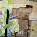
Products Used:
c/s - DCWV (black) & Prism (lt. pink)
photo corners - Canson
ribbon - Offray
eyelets - the Paper Studio
alpha stickers - unknown
title - computer font (Lainie Day), handcut from Prism c/s
acrylic token - Doodlebug
flower brad - Provo Craft
jewels - Heidi Swapp (pink)
No products have been added to this project.
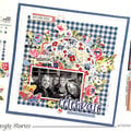
Thanks for spreading positivity!


February 05, 2007
January 28, 2007
January 26, 2007
January 23, 2007
January 23, 2007
January 23, 2007
January 22, 2007
January 22, 2007
January 22, 2007