

Scrapbook.com Exclusives 20% to 60% OFF
Plus, Take 10% OFF Orders $100 or More! Use Code: CRAFTY
Plus, Take 10% OFF Orders $100 or More! Use Code: CRAFTY

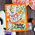
 Give a Cheer
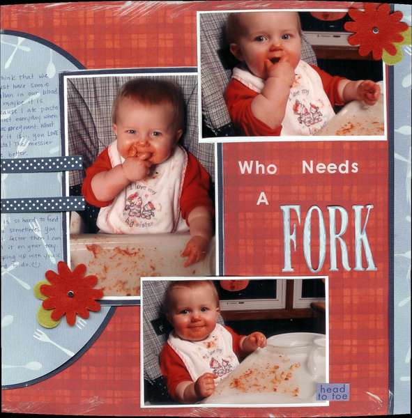
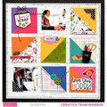
My messy little eater!


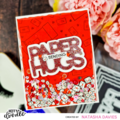
Thanks for spreading positivity!


April 12, 2007
April 07, 2007
April 07, 2007
April 06, 2007
April 04, 2007
April 03, 2007
April 03, 2007
April 03, 2007
April 03, 2007
April 02, 2007