I've added this to my faves because the idea is so original, the photos are so stunning and the journaling is perfect--I wish I had that show to see everyday. I do agree with much of what has been suggested--I think you need to define the photos from the background pp a bit and I think a different colour of pp for the journaling would work better with the photos (my thinking is a soft yellow...something that is close to the yellow in the sunrise of the top-right photo--also because the soft yellow would complement the soft lavender). I keep scrolling back up to see the photos because they're so beautiful (sunrise photos are hard to make look great too).
Amazing photos! Love the way you placed the photos! The journaling is great too!I think you should change the bg of the journaling to cream or light purple. Great use of the punches too!
Tiffany took the words right out of my keyboard. I am breathtaken! (Is that a word?) I also agree that you have such a clever concept. I don't wanna touch this because those photos are just absolutely beautiful, but I've stepped back and I'll just share with you a different approach. When I saw the white, I felt you could use more to make a window pane. Like Jess, I also got to thinking about inking which led me to wonder what if you didn't use white, but more of a parchment colored paper or a color closer to that lavender's complement on the color wheel. It'll make it even more vibrant. Also, I like the idea of doodles on the invitation or even more of those punches.
Annie, this is breathtaking! Your pictures are absolutely spectacular. Such a creative concept for this LO. I love the invitation and I also love the reverse punches that you used to hold everything. The changes that I would make would bend the rules of the challenge, but oh well.... I would definitely do a frame of some sort around the four pictures at the top of the right page to mimic your multi-pane window. Then I would mount the bottom picture in the same lavender color as the other photo mats. The colors on this LO are striking! Great job!
I really love the placement of everything. I could see a few little doodly things on that invitation, or maybe some inked edges (i believe this is allowed) beautiful photos
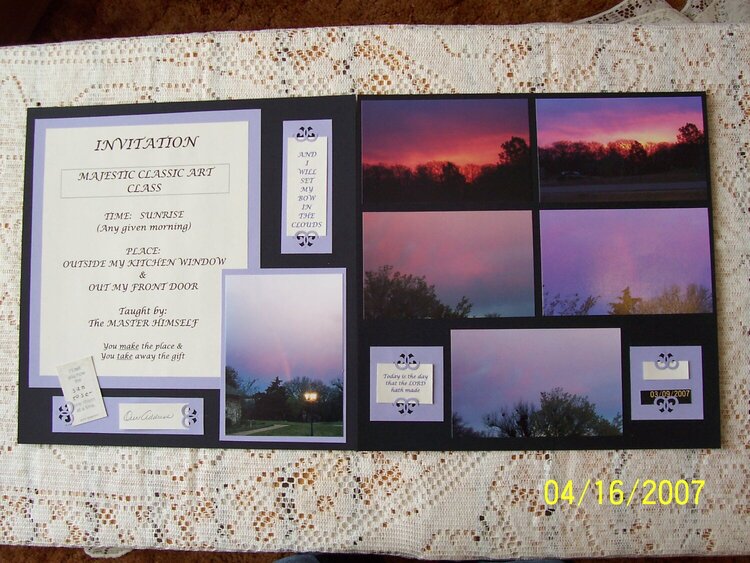
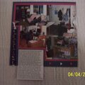
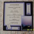
This LO is a portrayal of the gift I see out my kitchen window. Not using embellishments limited my ability to re-create my multi-pane metal window as much as I would like to have done. Left LO: The Invitation says: Majestic Classic Art Class, Time: Sunrise (Any given morning), Place: Outside My Kitchen Window & Out My Front Door, Taught by: The Master Himself, You make the place & You take away the gift. The picture shows an embelli holding the place of a matching piece that was damaged in transit that says "I'll tell you how the sun rose - one ribbon at a time." -emily dickenson, and a blank space for our address that I chose not to put on the net, the top right says, "And I will set my bow in the clouds", right Lo: left: " Today is the day that the LORD hath made"
Does this project or one of it's images contain pornography, profanity, or other illegal or offensive material? If so, please report it and our moderators will come by and clean it up in a flash.
April 19, 2007
April 18, 2007
April 17, 2007
April 17, 2007
April 17, 2007
April 16, 2007
April 16, 2007
April 16, 2007