I like that the flourish stamp draws my attention to what appears to be the focal photo. I also like the size of the Hang 4 font. In fact, I think this page has more visual interest that the other could use. See my comments on the opposing page.
Echoing my comments to the left side, love the curve, colors, white background, black & blue doodled dots, blue swirly & cutecutecute photos! I forgot to mention on the other side that coloring in the letters in blue is neat-o looking. Awesomely sweet sentiment too - "I love the way they love you!" - way to tug on the ol' heartstrings! It must be such fun & joy to watch them all play together. :o)
Love the bright colors of the pool against the white Tiff, it's lovely. The swirls are just amazing too .. love the journaling and the title, how creative.
The flow here is perfect and my eye runs smoothly across the pages.
The only thing I would have done is journal up and down the photos instead of in that block on the dirst page to encourage some more flow :)
Love this title!! very cute idea. Again, I love the flow and how it continues from the other page. The stamp is a great addition. Love the blue ink around the edges. Perfect LO
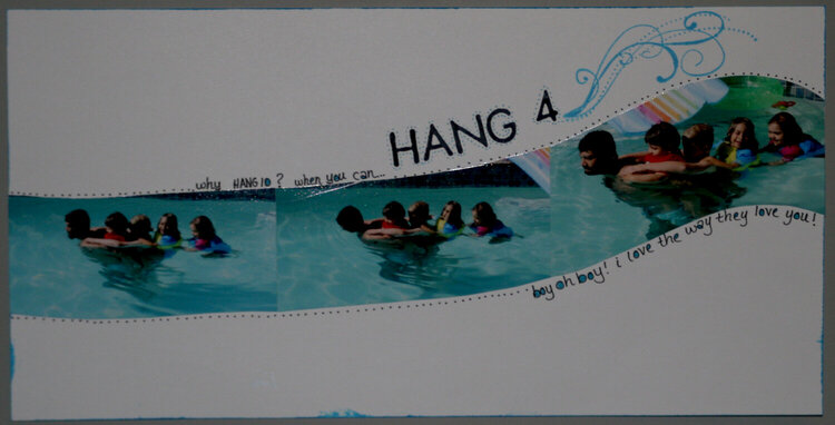
Rene and the kids at play in the pool. Journaling along the top reads, "why hang 10? when you can HANG 4" The bottom reads, "boy oh boy! i love the way they love you!"
Does this project or one of it's images contain pornography, profanity, or other illegal or offensive material? If so, please report it and our moderators will come by and clean it up in a flash.
August 06, 2007
August 04, 2007
August 04, 2007
July 28, 2007
July 26, 2007
July 22, 2007
July 21, 2007
July 16, 2007
July 13, 2007
July 13, 2007
July 13, 2007
July 12, 2007
July 12, 2007
July 12, 2007
July 12, 2007
July 12, 2007
July 11, 2007
July 11, 2007
July 11, 2007