

FREE Standard Shipping on Orders $69+ with code:
FREESHIPPING

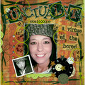
 Give a Cheer
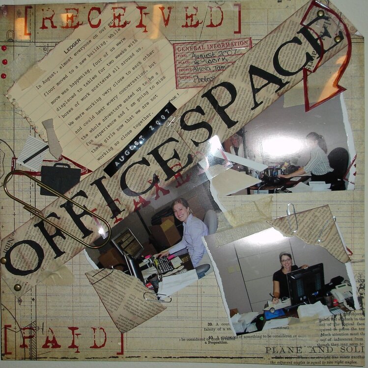
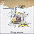
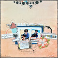
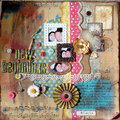
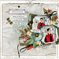
My goal for this page was to make it look like a collage you might see on a bulletin board...sorry about the flash on the middle of the page. I had a hard time getting a decent picture and did not have time to scan.
The transparencies on this page I printed using transparencies on my computer and the letters for office space were stamped using foam stamps.

Thanks for spreading positivity!


September 14, 2007
September 14, 2007
September 03, 2007
September 02, 2007
August 30, 2007
August 29, 2007
August 29, 2007
August 29, 2007
August 28, 2007
August 27, 2007
August 27, 2007
August 27, 2007
August 27, 2007
August 27, 2007