


FREE Standard Shipping on Orders $69+ with code:
FREESHIPPING

 Give a Cheer
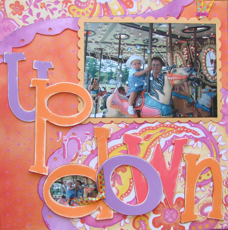
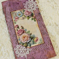
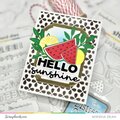
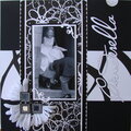
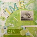
A Design Team layout using Zsiage papers. This is a photo taken of DGD (and me) in 2001...her first ride on a carousel. I think she was intent on what was going to happen next never having ridden on a merry go round before. These papers are really colorful and fun...the colors are really intense and totally out of my normal pallette. The chipboard letters are truly amazing...the package comes with its own little sander board and the letters are designed to distress and are self adhesive. I used a flex ruler to get the curves and then stitched two of the pp together...did the scallops by hand to mimic the paisley patterned paper. i normally wouldn't put a title on pp but the 5" size and distressing of the letters plus inking the edges with brown helpd the letters stand out. (I hope) and the "n" is a white sticker letter that I colored to "match" the pp as well...not that it is that noticeable in the photo...IRL it sticks out a little more.


Thanks for spreading positivity!


January 28, 2008
January 18, 2008
November 17, 2007
November 03, 2007
September 21, 2007
September 15, 2007
September 08, 2007
September 07, 2007
September 05, 2007
September 03, 2007
September 02, 2007
September 02, 2007
August 31, 2007
August 31, 2007
August 31, 2007
August 31, 2007
August 31, 2007
August 30, 2007
August 30, 2007
August 30, 2007
August 29, 2007
August 29, 2007
August 28, 2007
August 28, 2007
August 28, 2007
August 28, 2007
August 28, 2007
August 28, 2007
August 28, 2007
August 28, 2007
August 28, 2007
August 28, 2007
August 28, 2007
August 28, 2007
August 28, 2007
August 28, 2007
August 28, 2007