CS~I like the placement of the title. You might want to do so some journaling tags and hide them behind the ribbon and keep them peeking out on the right side.
*CS* Great job so far again! I agree with the double mat. Love the title. I might actually just do some doodling or rub ons on the title here and there. and some nice embellies along the page itself. love the blues!!!!
CS: I LOVE the different colors in the title--what a nice look. Hmm, do you have any ghost hearts or a similar embellie? With all the blues, I think something clear would be a subtle addition. I'd add it to the left of the photos, where they meet. And I like Carolyn's idea of shifting the title. Very nice start! :)
*CS* How about moving the photos up higher to the left and then put the title lower right, crossing the strip. I might also double mat the photos with a paler blue to lift them a little. The blues go nicely with the colours in the pics.
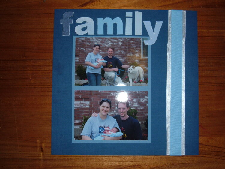
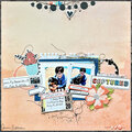
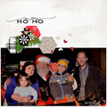
Not sure if I like the placement of the title (the title and the matted photos are not glued down yet). The letters in the title are all cut from different blue paper. If I add any journaling to the page, it would probably be hidden behind the matted photos.
Does this project or one of it's images contain pornography, profanity, or other illegal or offensive material? If so, please report it and our moderators will come by and clean it up in a flash.
September 13, 2007
September 13, 2007
September 13, 2007
September 13, 2007