FREE Standard Shipping on Orders $69+ with code:
FREESHIPPING
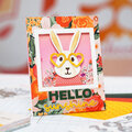
Be the first to cheer this project!

 Give a Cheer
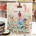
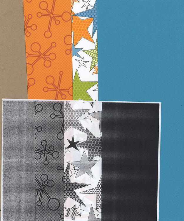
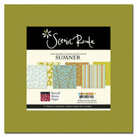
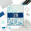
Look at the colors of cardstock and patterned papers I chose for an album cover. I wanted to have the papers have light, medium and dark color intensity but couldnt tell if the blue cardstock was dark. Color intensity isnt always easy to see, so I used a copy machine to help me see the true intensity in the patterned papers and cardstock. Projects look more interesting and appealing when light, medium and dark color intensity is present.
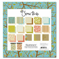
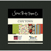
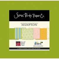
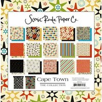
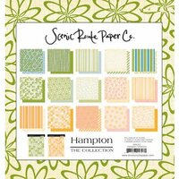
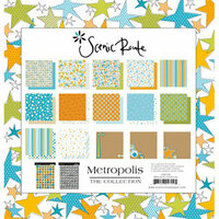
If I had used a different Scenic Route paper kit I could have had a coordinating Bazzill Basics Cardstock kit to go with it. I've include a couple of collections below to show you what's available. Be sure to use the Find-it-Fast feature in the Superstore to help you find coordinating kits and cardstocks.

Thanks for spreading positivity!