Livestream Party!
Join us today at 9:00am PT / 12:00pm ET | Details Here.
Join us today at 9:00am PT / 12:00pm ET | Details Here.

 Give a Cheer
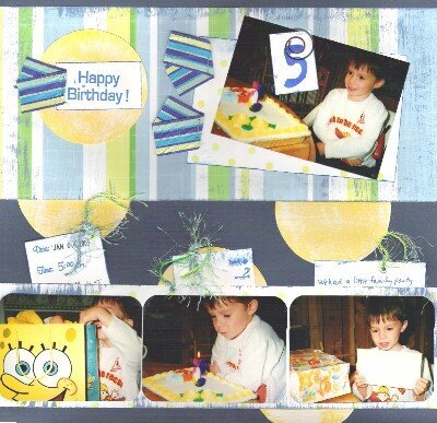
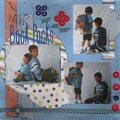
Paper ~ TLC
ribbon and fiber ~ Walmart
spiral clip~ Walmart
ink and paint
tags pull out with journaling
No products have been added to this project.


Thanks for spreading positivity!


April 04, 2005
April 03, 2005
April 03, 2005
April 03, 2005
April 03, 2005
April 03, 2005
April 03, 2005
April 03, 2005
April 03, 2005
April 03, 2005
April 03, 2005
April 03, 2005
April 03, 2005
April 03, 2005
April 03, 2005
April 03, 2005
April 03, 2005
April 03, 2005
April 03, 2005