SHCG - Mmm, you know I love me some actual memorabilia! I love all the ephemera here & the bib replica. Also love that shoe print. Cool how you kept the color scheme but changed the shapes, & kept the star brads/embellies & changed the placement (from lined up to scattered)... I am kind of wishing that either the little guys or the red triangles from pp 1 & 2 appeared here again, not necessarily because these pages "need" 'em but simply out of my own selfish desire to see them again! I also like Wendy's suggestion of inking the stars, they do seem a little stark. What a friggin amazing tribute to your schrubby - great job by you BOTH!
SHCG: I love that you included all of this ephemera! It will help your scrubby to remember all of his triumph! It's great that the colors carry over from the first two pager. The only thing I would change is the tilt of the information page. I would like it to tilt to the left towards the inside of the two page LO, if that makes sense. It would increase the flow. Great job!
SHCG: Love love this! I too love the detail of the shoeprint, it not only goes perfectly with the theme but is a nice creative touch. The memorblia is a great bonus as you dont see much of that in LO's. Wonderful job here Bren!
SHCG: I adore all of the ephemera. You are displaying exactly the perfect pieces. A true scrapbook! I would never guess that the bib was replicated. It looks exactly the same. I wouldn't change one minute detail on the left side. Sorry to be repitious, but.... I love the shoe print on the results too. It is such a subtle, yet absolutely cool touch. I am also digging the eclectic mix of ephemera on the page and its partner. My only suggestion on the right page (and it is so minor), is to mat the brackets and feets with either yellow or white so that they will pop a bit more. They get just a bit lost. Love this and love seeing your stuff, as always! (This is a compilation of the single pages.) :-)
SHCG: The shoe print was a wonderful idea. The only thing I can think of here would be to ink the yellow stars. They seem a little too stark and primary here compared to the rest of the colors and the brown shoe print.
SHCG: Well, pages 3 and 4 are as amazing as 1 and 2! I love the bib that you made and it's cool that you included it! The actual shoe print-awesome idea! I love everything here, but I do have a suggestion :) Make the bracket and the punched feet yellow- is hard to see them in brown, and you can use a little more yellow on the right page to balance the big bib on the left page. Amazing job!
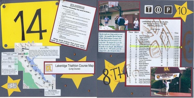
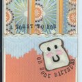
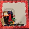
This is the second two-page spread of two for the SHCG Week #39 WC which was to create a lo about the men in our lives. I chose my schrubby. The left page includes a shrunken copy of the triathlon rules, the course map, and a replica of my schrubby's bib number secured with safety pins. Please see p. 1 for details and a photo of him wearing the actual bib. The right page includes the overall results of the triathlon long course event. The footprint is from the actual shoe my schrubby ran with, and it was done with brown pigment ink. Journaling reads: When the results were finally posted, we were ecstatic! One competitor reported that the officials failed to deduct 10 minutes from his final time since he participated in the second heat. This bumped him up to the top 5 and everyone else down a notch. No matter to us, though. You still placed in the Top 10--8th overall, and 7th among males. You did great, babe! [Once again, Moi, thank you for the Tombo pen.]
Does this project or one of it's images contain pornography, profanity, or other illegal or offensive material? If so, please report it and our moderators will come by and clean it up in a flash.
November 26, 2007
November 24, 2007
November 20, 2007
November 16, 2007
November 16, 2007
November 15, 2007
November 15, 2007
November 15, 2007
November 15, 2007
November 15, 2007
November 15, 2007