


Happy National Scrapbook Day!
Extra 10% OFF Select Scrapbooking Brands with Code: NSD24
Extra 10% OFF Select Scrapbooking Brands with Code: NSD24

 Give a Cheer
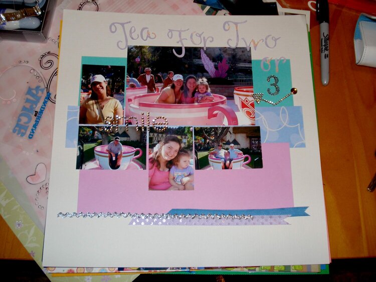
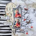
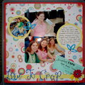
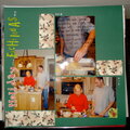
This is for the Jan use your scraps challenge, It isn't what I would consider my usual style, but I still like the way it turned out.
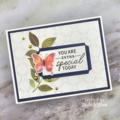

Thanks for spreading positivity!


February 06, 2008
February 02, 2008
January 31, 2008
January 27, 2008
January 21, 2008
January 11, 2008
January 09, 2008
January 09, 2008
January 09, 2008
January 09, 2008
January 09, 2008
January 07, 2008
January 07, 2008
January 07, 2008
January 07, 2008
January 07, 2008
January 07, 2008
January 06, 2008
January 06, 2008
January 06, 2008
January 06, 2008
January 06, 2008
January 06, 2008
January 06, 2008
January 06, 2008
January 06, 2008