

FREE Standard Shipping on Orders $69+ with code:
FREESHIPPING

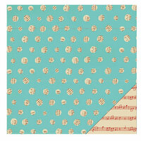
 Give a Cheer
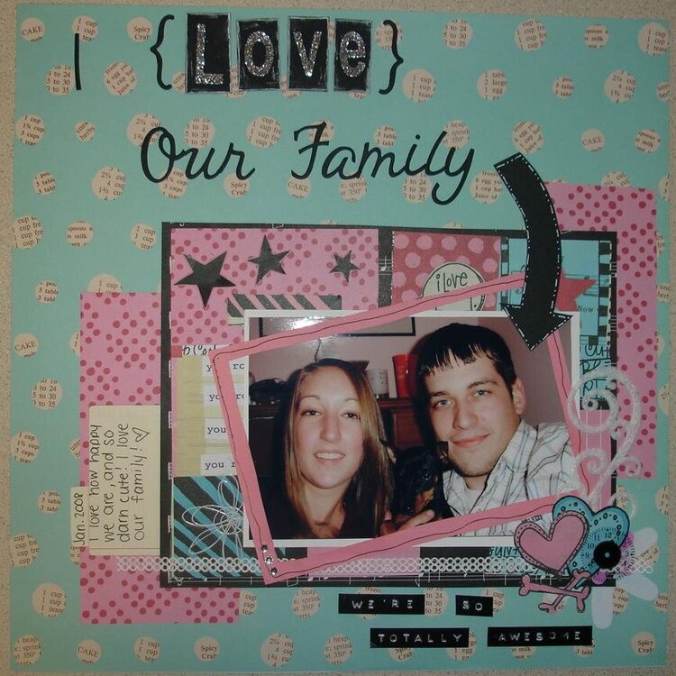
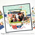
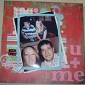
Just a fun page of our newly established family. Journaling: I love how happy we are, and so darn cute! I love our family


Thanks for spreading positivity!


April 03, 2008
March 04, 2008
February 18, 2008
February 15, 2008
February 11, 2008
February 08, 2008
February 05, 2008
February 03, 2008
February 03, 2008
February 03, 2008
February 01, 2008
February 01, 2008
February 01, 2008