
%20-%20Scrapbook.com)
Livestream Party!
Join us today at 9:00am PT / 12:00pm ET | Details Here.
Join us today at 9:00am PT / 12:00pm ET | Details Here.

 Give a Cheer
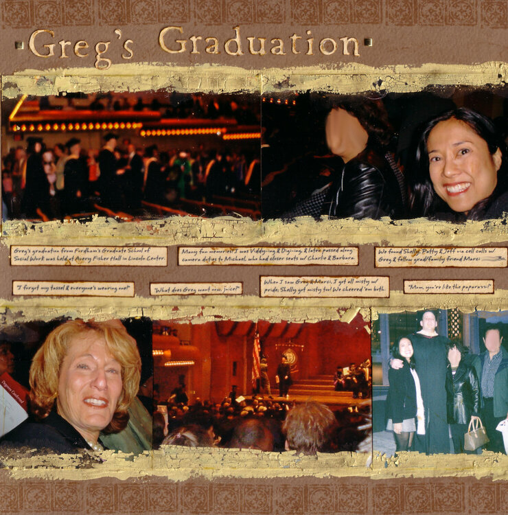
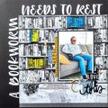
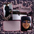
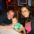
This is one side of my response to ~Alma Scrapera~/Nitza's Cardstock, Cardstock, Cardstock challenge for Scrap Happenzz Critique Group to not use patterned paper & focus on cardstock technique. Just try to visualize the smaller pics make film strips across the top & bottom that lead to the 5x7 on the right page of my hubby graduating from grad school (the right page looks a little weird without this left one next to it). Also note that my very cute parents are very private & prefer to be blurred online! The right edge cuts off a little in the scan.
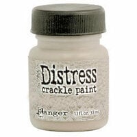
I stamped the background & matted the photos in crackle paint. Since the photos have a glossy nonporous surface & I forgot to sand the edges prior to painting, the paint started crackling off. So I had to seal it in w/ decoupage finish. I also inked the paint mattes w/ gold ink & added gold/coppery seed beads around the big pic; the bling factor of the gold ink, beads & brads doesn't come across as nicely in the scan as in person. I Mod Podged the title & journaling strips, to add shine & contrast. (I also ended up spilling paint & decoupage finish, having to retouch & reprint a photo TWICE but we won't talk about that, grr
)
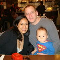
This LO chronologically comes before my You Are My Hero LO, in which you can see a better pic of my sweetie graduating - http://scrapbook.com/galleries/41507/view/1084409/-1/20/1.html. Also, this page is a lift of Kim Collee's Dream Come True page (Scraptivity's Notions newsletter & website).
Journaling:
- Greg's graduation from Fordham's Graduate School of
Social Work was held at Avery Fisher Hall in Lincoln Center.
- Many fun memories! I was Viddy-ing & Digi-ing, & later passed along
camera duties to Michael, who had closer seats w/ Charlie & Barbara.
- We found Shelly, Patty & Jeff via cell calls w/
Greg & fellow grad/family friend Marci.
- I forgot my tassel & everyone's wearing one!'
- What does Greg want now, juice?'
- When I saw Greg & Marci, I got all misty w/
pride; Shelly got misty too! We cheered em both.
- Text messaging to Greg after he walked across
the stage: Congrats Bub!' Answer: Kkkhee!'
- Mom, you're like the paparazzi!'
- Greg had to be there early, so he brought a sandwich,
which later ended up saving a grad having a diabetic attack!
- I am so very proud of my
Bubyhubby & his accomplishments!
ETA: The date appears on the LO that will come before this about what my parents & I did earlier in the day (went to the wax museum!).
TFL :)

Thanks for spreading positivity!


April 06, 2008
March 25, 2008
March 16, 2008
February 29, 2008
February 18, 2008
February 15, 2008
February 11, 2008
February 08, 2008
February 05, 2008
February 05, 2008
February 03, 2008
February 03, 2008
February 03, 2008