SHCG: Nitza, I love the combination of textures and colors on this layout. So retro! The journaling is so heartfelt and provides a perfect context for this photo. My eye wants a bit of the rust and yellow to the bottom left of the journaling just to balance the layout for me. However, I love this layout like it is, because it is GROOVY!
SHCG: You did such a good job on this! It definately has a 70's feel, and i love your placement here. I would suggest using more of an offwhite for the journaling. The white is really harsh against the rest of the page. I'd also switch out those green squares for something that meshes better with the page. Maybe orange?
SHCG: I really LUV this layout. It has a very '70s feel. The pattern paper stripe on the bottom reminds me of the wallpaper from that time. I just wish the photo was larger so we could see that grovey black velvet tiger painting (complete with it's own spotlight) and those outfits.
SHCG: I, too, love the retro feel of this page. I think it's well accentuated by the pp panel, the vellum flowers, and the felt flowers; but you can't beat the velvet tiger poster behind the two of you! So 70s! I appreciate the handiwork on this page, as well--the stamped cs and the inked black panels. However, I find all the stamps to be a little distracting, and I don't think the green dots gel very well with the page. I'd probably do with one or two less stamps, and diagonals or plaid, like on your clothes. While I do like the faded look to the photo, I'd recommend playing with the tint on the computer and making it more of a red tint reminiscent of those old 70s photos; I think it'd complement the rest of the page better. I'd also be curious to see how the page would work with the journaling pushed up over the top left corner of the notebook pp, and "ricky & nitza" placed under the photo. I like that notebook pp, btw, and the paper bag grainy feel to the bg cs.
SHCG: Somehow I missed this one. I love the retro feel of this LO, appropriate in preserving an older memory. The journaling is excellent and relays so much more about the photo. Great job.
SHCG - Wonderful work, Nitza, I love all the stamping - is this your response to your BWC? Cuz the red design & the green on the black definitely look like fantastic pre-made patterned paper. Like the floating "cherish"es as well. Super vivid journaling & accompanying retro (& cute) photo. I am liking the suggestions to ink or matte the notebook paper, to call a little more focus to the photo. Also like QueenMel's idea of having the notebook paper peek out from under the border. Outstanding work, Nitza - great to see your lovely linear pages again after your relocation hiatus! :)
SHCG: I love that you have a specific memory of what was done with this photo and that your dad sent you tapes. That is so wonderful. This is an awesome layout. The only thing I would do is ink the lined paper and put a small piece of it peeking out from underneath the border.
SHCG: The red patterned paper on this page is so wonderful and fits right in with the stamped "cherish". The picture on this page is so cute and really worth making it stand out, so I think I would add a red square of background paper behind the picture. It would tie in with the other reds you have on the page and make the picture "pop" off the page and draw the viewer's eye right to it. I also think you should ink your journaling tag and the notebook paper, just the edges with maybe a subtle brown. I love the felt flowers!!
SHCG: I love the square blocks behind the journaling block. Love that strip of red pp. Love the little piece of notebook paper, goes along well with your age in the picture. To make the papers match the feel of the picture, I think I'd add some inking. Ink around the edges of the background, notebook paper, white journaling block.. maybe even make this a cream color. So great that you still have this picture. isn't it amazing how far cameras and pictures have come.
SHCG: I love the title font. I might consider changing the background paper to a different color though, or perhaps backing the "notebook paper" on a different color to draw more attention to the photo.
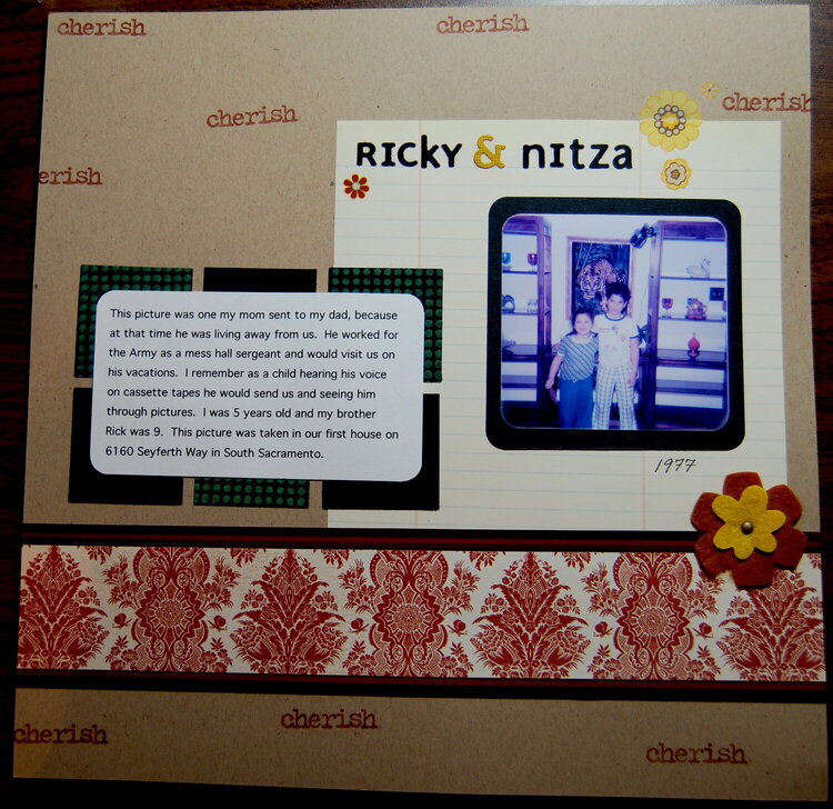
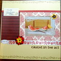
I stamped the cardstock with "Cherish" to make it look like a pattern. I also stamped the black square with green ink. I added a felt flower and some rub on flowers. I scanned an old photo and printed it out for this layout.
Does this project or one of it's images contain pornography, profanity, or other illegal or offensive material? If so, please report it and our moderators will come by and clean it up in a flash.
April 06, 2008
March 03, 2008
February 25, 2008
February 23, 2008
February 22, 2008
February 19, 2008
February 17, 2008
February 16, 2008
February 16, 2008
February 16, 2008
February 15, 2008
February 15, 2008