Thank YOU! It's Customer Appreciation Week!
EXTRA 11% OFF Orders $100+ With Code: THANKYOU
EXTRA 11% OFF Orders $100+ With Code: THANKYOU

 Give a Cheer
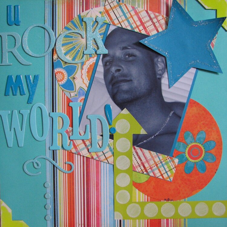
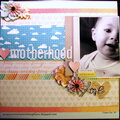
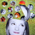
did this layout of my husband for the Funkified Challenge to do a layout inspired by Kristie Bentley
No products have been added to this project.

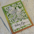
Thanks for spreading positivity!


March 28, 2008
March 26, 2008
March 22, 2008
March 16, 2008
March 15, 2008
March 14, 2008
March 11, 2008
March 11, 2008
March 11, 2008
March 10, 2008
March 07, 2008
March 06, 2008
March 05, 2008
March 02, 2008
March 01, 2008
March 01, 2008
February 28, 2008
February 28, 2008
February 28, 2008
February 27, 2008
February 27, 2008
February 27, 2008
February 25, 2008
February 25, 2008
February 25, 2008
February 25, 2008
February 25, 2008
February 25, 2008
February 24, 2008
February 24, 2008
February 24, 2008
February 24, 2008
February 24, 2008
February 24, 2008
February 24, 2008
February 24, 2008
February 23, 2008
February 23, 2008
February 23, 2008
February 23, 2008
February 23, 2008
February 23, 2008
February 23, 2008
February 23, 2008
February 23, 2008
February 23, 2008
February 23, 2008
February 23, 2008
February 23, 2008