FREE Standard Shipping on Orders $69+ with code:
FREESHIPPING

Cheers
Give a Cheer

 Give a Cheer
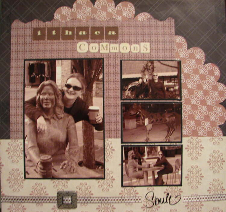
This is an older layout I did of a trip to Ithaca - this "stone" lady was a riot and the cool metal art in the commons was just too cool not to scrap!
No products have been added to this project.


Thanks for spreading positivity!


March 07, 2008
March 05, 2008
March 01, 2008
March 01, 2008
February 29, 2008
February 29, 2008
February 29, 2008
February 29, 2008
February 29, 2008
February 29, 2008
February 29, 2008
February 29, 2008