FREE Standard Shipping on Orders $69+ with code:
FREESHIPPING

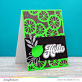
Cheers
Give a Cheer

 Give a Cheer
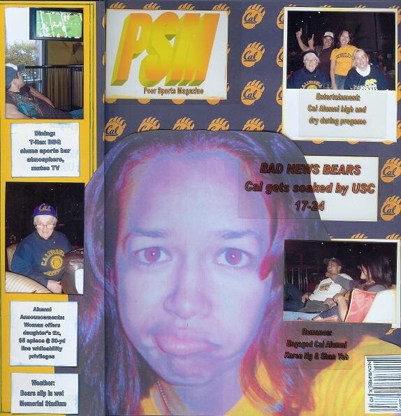
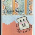
This is for the 2007 SHCG Week #43 WC - Making Headlines, which was to create a lo inspired by a newspaper, tabloid, or magazine cover. I named my cover Poor Sports Magazine. The left margin from top to bottom reads:
Dining: T-Rex BBQ shuns sports bar atmosphere, mutes TV
Alumni Announements: Woman offers daughter's tix, $5 apiece @ 50-yd line w/disability privileges
Weather: Bears slip in wet Memorial Stadium
The right margin from top to bottom reads:
Entertainment: Cal Alumni high and dry during pregame
BAD NEWS BEARS
Cal gets soaked by USC 17-24
Romance: Engaged Cal Alumni Karen Ng & Shan Yeh
The bar code contains the date, November 10, 2007
No products have been added to this project.

Thanks for spreading positivity!


April 14, 2008
April 04, 2008
April 02, 2008
March 31, 2008
March 28, 2008
March 17, 2008
March 16, 2008
March 16, 2008
March 15, 2008
March 14, 2008
March 12, 2008
March 11, 2008
March 10, 2008
March 10, 2008
March 10, 2008
March 10, 2008
March 10, 2008