


Happy National Scrapbook Day!
Extra 10% OFF Select Scrapbooking Brands with Code: NSD24
Extra 10% OFF Select Scrapbooking Brands with Code: NSD24

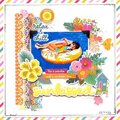
 Give a Cheer
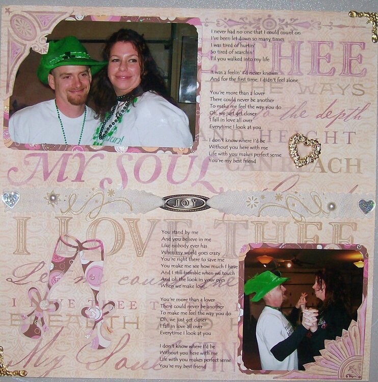
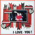
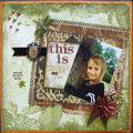
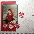
My SIL wedding reception....their song was "My Best Friend" by Tim McGraw.
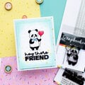
Thanks for spreading positivity!
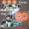


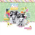
March 26, 2008
March 26, 2008
March 26, 2008
March 26, 2008
March 26, 2008
March 26, 2008