SHCG: Christy I love that you are catching up on your girls' albums. Knowing that half of the battle is just getting the pictures on the page when trying to catch up! This looks great and the journaling is so sweet and precious! My only suggestion would be to tilt the title so that it is horizontal. Otherwise, I wouldn't change a thing. Love it, your love shines through here.
SHCG: So sweet that you're scrapping these early and precious photos of your daughter. I like the wavy title block shape, and I love that you used a textured white mat. I'm resisting the add a flower embellishment suggestions, and going with the white scalloped mat to go behind the journaling that is much like the suggestion I offered on your Talk Talk lo. A different suggestion to consider is to put the journaling on a rounded rectangular tag shape and attach a ribbon, perhaps anchor it to the title block or photo mat.
SHCG: What great photos. Luv how you picked up the blue flowers in the chair in the mats and background paper. I can't believe I am saying this..but one or two tiny flower embellishments wouldn't hurt.
SHCG: Those pictures are so adorable!! I also would have to suggest using something besides bright blue. I think it distracts from the photos and would suggest using something such as a cornflower blue color or a brown color. I would also matte the journaling as well...just to make it look like it belongs on the page.
SHCG: I like the shock of the blue against the soft pp. I would have done the journaling on a light cream cs, and matted it on the bright blue so that the blue would be more of an accent. Very nice as is though, and kudos on going back so far and catching up!
SHCG: Adorable LO Christy!! I think inking the blue would tie it in with the pics and make it less of a focal point, letting the cuteness of the pics be more of the focal point..
SHCG - How precious is this, Christy! I love the photos, & your adoration of DD clearly comes across in your journaling. I think the combo of the soft colors & pp w/ that blue is lovely. I do admit my initial reaction is to ink the title & its matte in a medium honey brown, to emphasize the "messiness" as well as to emulate the look of wet pretzel everywhere!
SHCG: I might have chose a different color than the bright blue to back the photos on (I think a yellow to match the flowers in the pp background would work well.) Very cute photos!
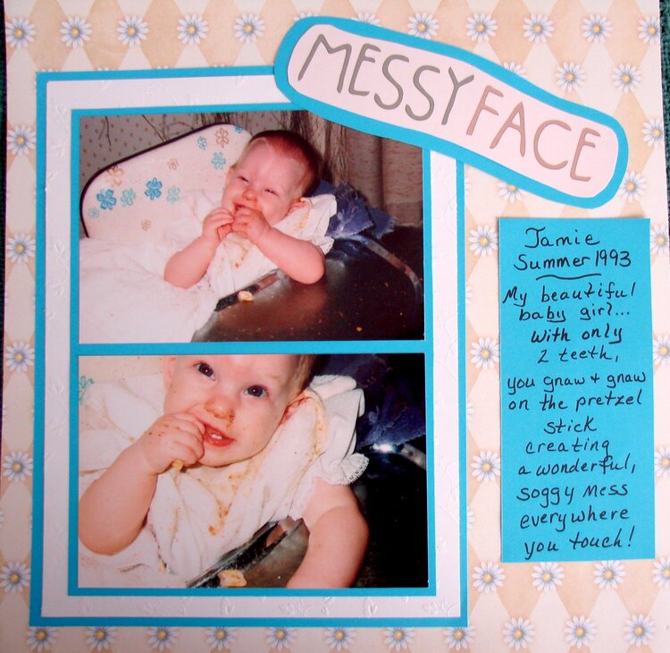
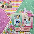
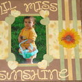
I'm trying to get caught up on both of my daughters albums. This is a LO of my now 15 year old, Jamie. Due to the fact that I have so much to catch up on, i'm trying to create eye pleasing LO's but maybe not all of the LO's will be extremely detailed but I am still open to suggestions!
Does this project or one of it's images contain pornography, profanity, or other illegal or offensive material? If so, please report it and our moderators will come by and clean it up in a flash.
July 10, 2008
June 22, 2008
April 21, 2008
April 18, 2008
April 15, 2008
April 14, 2008
April 14, 2008
April 13, 2008
April 12, 2008
April 12, 2008
April 12, 2008