
Happy National Scrapbook Day!
Extra 10% OFF Select Scrapbooking Brands with Code: NSD24
Extra 10% OFF Select Scrapbooking Brands with Code: NSD24

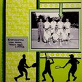
 Give a Cheer
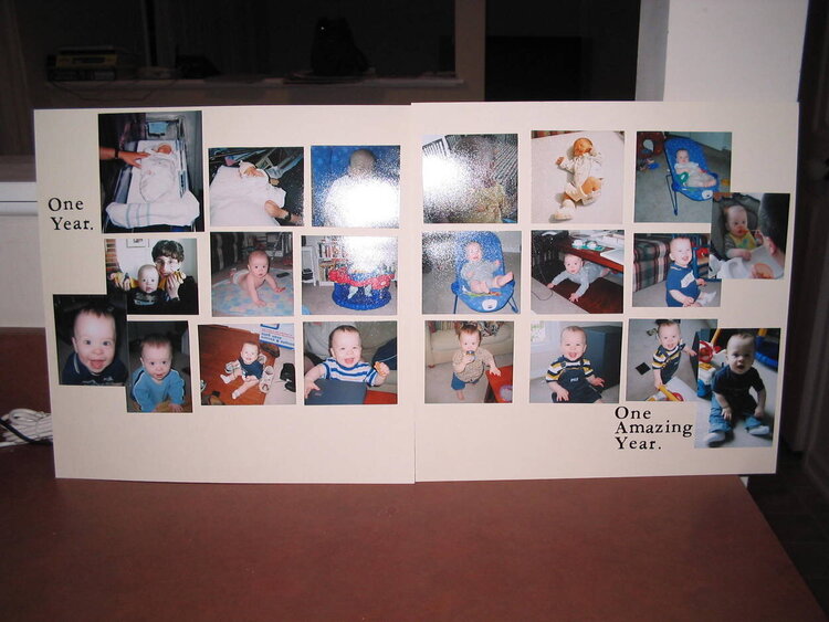
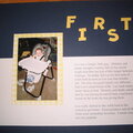
This is a scraplift off of a Diamonds are Forever Ad. Here is the link: http://www.adiamondisforever.com/hot/asadvertised.html
It's the second ad. If you look at the ad, you will see that it has a line under the collage. Does anyone have any suggestions - or maybe I should leave it as it is.
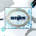
No products have been added to this project.
Thanks for spreading positivity!


August 15, 2005
August 03, 2005
August 02, 2005
July 29, 2005
July 29, 2005
July 29, 2005
July 28, 2005
July 28, 2005
July 28, 2005
July 28, 2005
July 28, 2005