
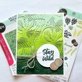
Happy National Scrapbook Day!
Extra 10% OFF Select Scrapbooking Brands with Code: NSD24
Extra 10% OFF Select Scrapbooking Brands with Code: NSD24

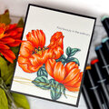
 Give a Cheer
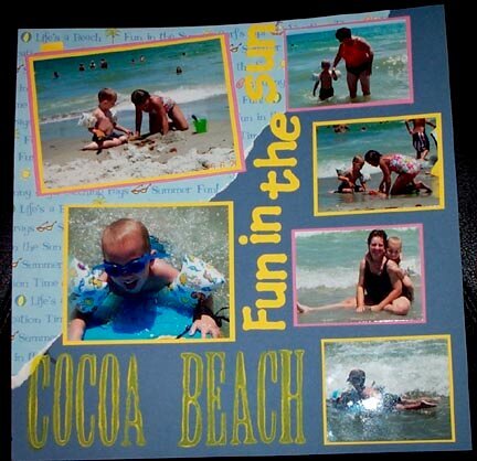
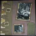
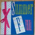
Here is my layout I started in Fl and just finished. I think I like everything about it except for the painted title- It just doesn't seem right- you cna see the blue paper through the paint and it just doesn't seem as bright as all the other words. Do you think it looks ok, or should I somehow re-do it? Journaling is hidden behind the top left photo
No products have been added to this project.
Thanks for spreading positivity!


August 01, 2005
July 31, 2005
July 30, 2005
July 30, 2005
July 30, 2005
July 30, 2005
July 30, 2005