SHCG: Oh, you know I'm more of a less is more kind of girl, so for me the layout feels busy. I think I would have gone without the grey stamps in the background and I would have chose a larger or a smaller design on the picture mats. The mat paper seems too similar to the borders. Also, the red triangle has me focused on the plate of dishes and not on the sandwich. I love the journaling block with the Carnegie Deli title font. That looks cool! And, the photos are cute! TFS!
SHCG: Sharon, I have so missed looking at your fabulous multi-photo layouts! This one is no different. It is terrific. Hang on, let me wipe the saliva from my keyboard. Mmmmmmmm, I can barely type because that food has hypnotized me. Ok, back to business. I adore everything about this, including your use of the modified movie quote. Perfect! The only thing that I would add is one more red star at the top left overlapping with the photo. Other than that, why mess with perfection?
SHCG: This is a really cool page! I like how you used a really busy pp for the photo mat- great look. Awesome journaling- something you are always very good at. I also agree that a third star in the upper corner would look good.
SHCG: Wow, these pictures and this layout really convey a very fun time. I really like those red stars and would maybe suggest that you use a couple more. Maybe a larger one in the upper left corner to fill in some of that blank space.
I think I had some of that multi-toned square paper, too, and this is a great use of that and a great response to your CG challenge! Nice work, as always.
SHCG: LUV your choice of paper, matting, the die cut stars, and B&W brads. The photos are a riot and the quoteis perfect. My only suggestion would be to put the Carnegie photo on top so we can see the "Carnegie".
PS your photo captions are fabulous
SHCG: You are so awesome at creating fun, informational LO's and this one does not dissapoint! If I were to suggest something, maybe a date up in the upper left somewhere? Other than that, this is perfect as is!
The colors here are so cool! Love the stars! The pics of the food-yummy! Is that man in the green shirt your FIL? If so you have a family fool of " famous " people-your dh looks like the guy from " dinner impossible", your FIL-Michael Bolton:) Great lo!
SHCG: This is a well-conceived response to your own BWC. I have the same orange/black pp and I've never considered for anything other than a Halloween lo, so wtg for thinking outside of the box. This page definitely captures the retro deli with the retro movie decor theme, especially with the font and those brads (love those!). Kinda wish those brads weren't so close to the ends of the title so that they wouldn't compete with the font, and I'd like to see a glittery gold glitz outline on each of those red stars. It might be cute to put the names of two dishes, one in each of the stars, like on the Hollywood Walk of Fame. I can see Janet's point of the top left corner. Tthose doodle-y stamps are such a great addition to the page, so I can see just a small portion of the criss-cross one peeking out from the top pp strip positioned between the other two stamps. An alternative suggestion would be part of a smaller red star poking out. I am also impressed by how well your overall color combo works. Fun memory, great one to scrap.
SHCG: Neat page! I love all the work you put into this. The top left corner needs something though... I just can't figure out what. Maybe a few tiny stars.
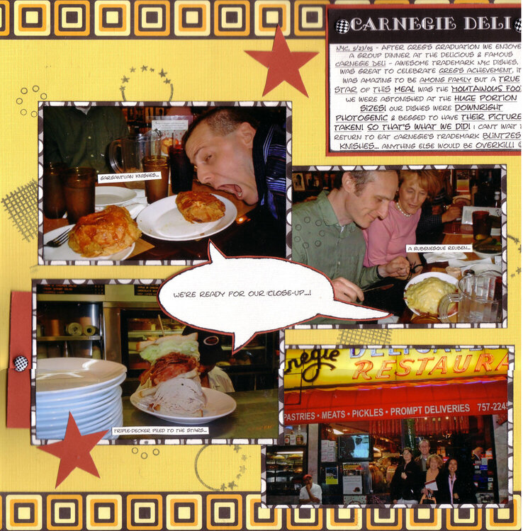
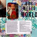
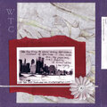
This is my response to my challenge for Scrap Happenzz Critique Group to use a movie quote from The American Film Institute's Top 100 Movies Quotes in a LO's title or journaling (slight adaptation of the quote allowed so long as the quote's recognizable). Here's a link to that list: http://www.cnn.com/2005/SHOWBIZ/Movies/06/22/film.moviequotes.list.ap/index.html This LO comes chronologically after my “Greg's Graduation” & “You Are My Hero” LOs; after DH's grad school grad, we all went to Carnegie Deli to eat. The FOOD at Carnegie Deli is ENORMOUS so we ended up taking pics of our dishes! So I used #7 from the list - "All right, Mr. DeMille, I'm ready for my close-up," ("Sunset Blvd.," 1950).
Journaling: “NYC, 5/23/05 - After Greg's Graduation we enjoyed a group dinner at the delicious & famous Carnegie Deli – awesome trademark NYC dishes. It was great to celebrate Greg's achievement, it was amazing to be among family but a true star of this meal was the MOUTAINOUS FOOD! We were astonished at the HUGE portion sizes! Our dishes were downright photogenic & begged to have their pictures taken! So that's what we did! I can't wait to return to eat Carnegie's trademark blintzes & knishes… anything else would be overkill! :o)” Then I have a caption bubble for the food we had photographed, saying "We're ready for our close-up...!" There are also explanations by each photo-worthy dish saying what they were...“gargantuan knishes….,” “a Rubenesque reuben…,” & “triple-decker piled to the stars…”
Please note that the scan cuts off the right margin, where the rest of that right brad, the right edge of the red journaling matte & the whole other right margin is. The scan stitching of the halves is also imperfect...oh well...
We lived in the ‘burbs at that time so when DH graduated we took a few days off & stayed in NYC, making a holiday out of it, plus family members including my parents came in from out of town; it was a nice getaway. So the triple decker pic is a pocket, & the red flap pulls out, revealing another group pic w/ my parents & details on what DH & I did the next day in the city.
Because of the cinematic nature of the challenge, as well as the whole NYC/showbiz feel at Carnegie Deli (the interior walls are plastered w/ actor headshots of performers, unknown & famous alike) I tried to achieve a movie-esque type feel w/ the filmstrippy square pp on the top/bottom & the somewhat-clapboard-y journaling/title. It was fun! The stars & caption bubble were my adaptations of shapes from Word Art.
Does this project or one of it's images contain pornography, profanity, or other illegal or offensive material? If so, please report it and our moderators will come by and clean it up in a flash.
August 07, 2008
July 10, 2008
June 22, 2008
May 26, 2008
May 17, 2008
May 08, 2008
May 03, 2008
May 02, 2008
May 02, 2008
May 01, 2008
May 01, 2008
April 28, 2008
April 28, 2008
April 26, 2008
April 26, 2008
April 26, 2008
April 26, 2008