FREE Standard Shipping on Orders $69+ with code:
FREESHIPPING


Cheers
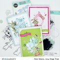
Give a Cheer

 Give a Cheer
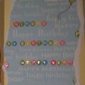
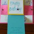
Another simple scheme scraplift. (see how much inspiration I get from one magazine?) I really like how this came together. Papers are stampin up!, there is a little acrylic shell and the metal number tags are colorbok. blue brads are making memories, "holy" tag is Me and MY Big ideas.
No products have been added to this project.

Thanks for spreading positivity!


August 18, 2005
August 16, 2005
August 14, 2005
August 12, 2005
August 12, 2005
August 12, 2005
August 11, 2005
August 11, 2005