FREE Standard Shipping on Orders $69+ with code:
FREESHIPPING

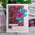
Cheers
Give a Cheer

 Give a Cheer
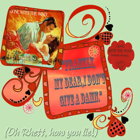
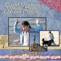
lo for weekly challenge scrap happenzz-top 100 movie quotes. this quote happens to be #1:http://www.scrapbook.com/forums/showtopic.php?tid/1462461/-i digi dare you.
gone with the wind by margaret mitchell; groovy doodles.(yes there are buttons on the lo!)
No products have been added to this project.

Thanks for spreading positivity!


June 23, 2008
June 01, 2008
May 30, 2008
May 29, 2008
May 28, 2008
May 28, 2008
May 27, 2008
May 26, 2008
May 26, 2008
May 26, 2008
May 16, 2008
May 16, 2008
May 16, 2008
May 16, 2008
May 16, 2008