Livestream Party!
Join us today at 9:00am PT / 12:00pm ET | Details Here.
Join us today at 9:00am PT / 12:00pm ET | Details Here.


 Give a Cheer
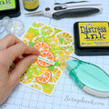
No products have been added to this project.


Thanks for spreading positivity!


July 11, 2008
June 23, 2008
May 30, 2008
May 29, 2008
May 29, 2008
May 28, 2008
May 28, 2008
May 27, 2008
May 27, 2008
May 27, 2008
May 26, 2008
May 26, 2008
May 24, 2008
May 24, 2008
May 24, 2008