SHCG: maybe I will have better luck leaving feedback on this page. LUV the photos and your team die cut. Writing on the photos is interesting but it almost looks like you are all standing in front of graffitied walls. I am going to have to ponder this some more.
SHCG - (copying pertinent stuff for this side from my overall critiques on the 2 pg spread). Way cool w/ the dual challenge responses on each side of this 2 pager here! Marvelous title too, to-die-for cool 'n cute. Simply fantastic how you kept up this reverse image yellow/green scheme & conveyed an athletic feel throughout the whole shebang. The photo tinting on the left is a great remedy to the poor lighting you didn't like. The writing on the photos is fantabulous, I feel like I'm peering onto a cool chick's yearbook! Awesome so far. Now, going back to that photo tinting, while I appreciate the true colors on this right side, I am wishing the photo tinting from the left side continued here, because as the yellow/green cardstock scheme reverses from left to right, I kind of feel like the photo tinting will continue its checkerboard as I look left to right & it doesn't. I'm also not crazy about someone's face split in half, but truth be told, I didn't even notice until it was mentioned below! Otherwise, LOVE the double challenge whammy, love the jock-type feel, the fun you convey through the writing on the photos... suh-weet & fabulous LO!!
SHCG: Again, love the doodling! I would like to see some doodling on the top pics though, just for consistency. I can see the word "Intensity" on the top right pic! LOL- they are so into the game in that one!
SHCG: See my comments about the straightline doodling around the outside of the page on 1rst page comments. I would continue that here. Again I love the journaling on the photos and these photos are crisper. Nice job!
SHCG: I know what game we would have had our eyes on! Go Bears! I find it disconcerting that you had to use Oregon's colors (minus their hideous black on black uniforms) on this layout because of the A's colors. I know where you sweet little, devilish heart lay. (lie?) (has lain?) Ehhhh, what about laid. Booohahahahaha
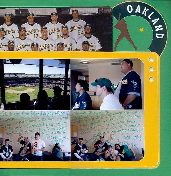
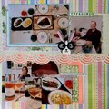
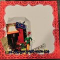
This is for the SHCG BWC #11-Write on your photos. I thought these photos were perfect to doodle and write on, because of all the space above my subjects in the bottom two photos of this page. (I was having trouble with the viewfinder on the camera, and kept misreading the frame.)
The brown cs baseball player was made from a stencil, the baseball is a Mrs. Grossman sticker, and the Oakland arch was cut from one of the souvenir posters distributed at the game.
The far left of the photo block can be lifted, where it meets with the left page, for a peek at the rest of the team photo which was also distributed at the game.
This is page 4 of 5 that I scrapped for this event.
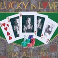
Journaling reads: While the rest of the folks dutifully watched the game, we had our eyes glued to the four TV screens on the wall--the baseball game, golf, and two football games. Of particular interest to us was the Cal vs. Oregon game. We begged the ushers to let us stay until the end of the Cal game which had us at the edge of our seats. With 22 seconds left, a touchback, ruled in our favor, secured a win for Cal 31-24 against a very defeated Ducks! Woo-hoo!
Pictured from left to right: Kazuo, Vinnie, Aaron, Seester
Does this project or one of it's images contain pornography, profanity, or other illegal or offensive material? If so, please report it and our moderators will come by and clean it up in a flash.
July 10, 2008
July 07, 2008
July 05, 2008
July 01, 2008
June 26, 2008
June 24, 2008