SHCG: this is really weird I thought I already left you feedback but I don't see it and twice now trying to leave feedback I just got kicked off your page so I will be quick. Great Page LUV the doodling on the photos.
SHCG - (copying pertinent stuff for this side from my overall critiques on the 2 pg spread). Way cool w/ the dual challenge responses on each side of this 2pager! Marvelous title too, to-die-for cool 'n cute. Simply fantastic how you kept up this reverse image yellow/green scheme & conveyed an athletic feel throughout the whole shebang. The photo tinting is a great remedy to the poor lighting you didn't like. I wish I could zoom in to see the textured cardstock but I take your word for it. Awesome so far. Now, going back to that photo tinting, I am wishing the photo tinting shown here continued on the opposite side, because as the yellow/green cardstock scheme reverses from left to right, I kind of feel like the photo tinting will continue its checkerboard as I look left to right & it doesn't. Otherwise, LOVE the double challenge whammy, love the jock-type feel... suh-weet & fabulous LO!!
SHCG: I love the doodling! You did a really great job; it replaces the interest that pp brings. I also really like how you made the page interactive- it's a great way to add more pics to the page. The title is funny too. :)
SHCG: LOVE the writing on the photos! Love the tinting, very creative thinking! I will have to remember that for bad lighting photos! I have to say that I feel its missing something, maybe some slight straightline doodling around the top, left side and bottom. Also, maybe some baseball "stitching" doodles on the letters of the title.
SHCG: Please see my comments on the 2 page spread, but I couldn't resist the opportunity to notice your amazing penwork on the title, on the pictures, and around the pictures. I just love the look of the writing on the walls. Fabulous, babygirl!
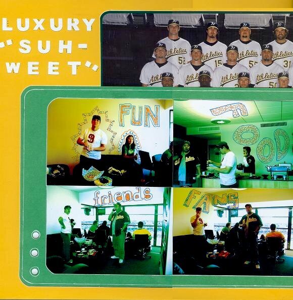
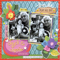
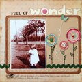
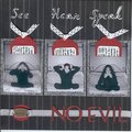
This is for the SHCG BWC #2-Cardstock, Cardstock, Cardstock, which was to create a lo with a focus on cs techniques, no pp. I used two plain cs and one textured for the title, all from DCWV; traced a border and doodled around the title and on the photos with Sakura pens; and added metal "brad" stickers.
Finally, I had bad lighting to deal with, so I added green tint to two of the photos on this page, and a yellow tint to the other two.
The photo blocks can be lifted, where the pages meet, for a peek at the rest of the team photo which was distributed at the game.
This is page 3 of 5 that I scrapped for this event.
Does this project or one of it's images contain pornography, profanity, or other illegal or offensive material? If so, please report it and our moderators will come by and clean it up in a flash.
July 10, 2008
July 07, 2008
July 05, 2008
July 01, 2008
June 26, 2008
June 24, 2008