SHCG: I love the colors and the the whole concept and design. I would move the flower that's on the bird to just slightly overlap the lower part of his body. Just to give the illusion that he is behind it, rather than it being stuck to him.
SHCG - Oooh, what a pretty & heavenly page! I love the soft colors...combined w/ all the dreamy images (the flowers, swirls, bird & fairies) you really create such a fantastical, heavenly atmosphere here. I am wondering who is the fairy image in the center - is it a pic of one of your DGD? If so, I would agree w/ Christy's suggestion to take out "& then they are gone" from the quote (if it's not one of your DGD, then disregard). Also, I was thinking what Tiff wrote before I even read her critique, the fairy's torso seems cut off abruptly...perhaps insert a swirl/cloud/flowers, or a faded body, to conceal where her torso ends. Overall, this is absolutely gorgeous... I wanna be transported to this garden!!
SHCG: Love the fantasy element you have working here. I love the wings that you used here. Beautiful. My two suggestions are to either find a way to extend the length of her body or place an element ther for it to "disappear" behind and I want the quote to be less boxy. I'd like to see it in a scroll type fashion. Something whimsical to match the feel of the layout. It is pretty and definitely fairy-licious!
SHCG: I love the fairy dreamland feel to this page, all the layers, and great digi work. I have a few suggestions and critiques. I'd like to see what the banner looks like in creme with gold borders. Also, there needs to be a comma between dawn and bless. Lovely phrase, btw. The fairy is cute, but it draws my attention from the focal fairy, so I'd go with Jesse's suggestion. I like the bright pink flower on the far right, just above the fairy's right wing, as well; but, it needs to be anchored to something. Maybe more flourishes between it and the flower underneath it. Fun fairy page, Marsha!
SHCG: Digital lo's amaze me- you've added so many different dimensions here! The only thing that is sticking out to me is that the fairy next to the bird is very detailed while the other elements (the bird and scrolls) are more artistic.... I really can't decide if the fairy just doesn't fit or it's a nice contrast. Maybe try and swap in a fairy more like the bird and see if it seems more appropriate? I really like the concept of the page!
SHCG: So pretty! I am amazed at all the elements you include - they are great! I would suggest changing the color of the quote/title strip though, as it fades into the page too much for me.
SHCG: Beautiful elements to this LO. I know this may sound strange, but I would remove the "and then they are gone" from the wording on this lo, other than that, pretty lo!
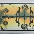
for july digi only OSTENTATIOUS ORNAMENTATION challenge: 1 fairy wings brush 2&3two flowers4 bird with flower 5 ribbon 6 corner overlay: from petals and wings(http://kjoistudios.com/shop/index.php?main_page=advanced_search_result&search_in_description=1&keyword=petals+and+wings). 7 fairy 8 fairy dust 9 background paper 10 saying ribbon and third flower from garden fairy kit. child from the Origional Maker.
Does this project or one of it's images contain pornography, profanity, or other illegal or offensive material? If so, please report it and our moderators will come by and clean it up in a flash.
July 21, 2008
July 18, 2008
July 16, 2008
July 15, 2008
July 13, 2008
July 12, 2008
July 12, 2008
July 10, 2008
July 07, 2008
July 06, 2008
July 06, 2008
July 06, 2008
July 06, 2008
July 05, 2008
July 04, 2008
July 04, 2008
July 03, 2008
July 03, 2008
July 03, 2008
July 03, 2008
July 02, 2008