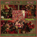
SHCG: I like the skinnier font of the RHCP lyrics, the positioning change of the moon, and the way you remedied your use of the phrase by putting it on the truck. I'm still wishing the frame was gone, in keeping with the dreamy quality of this lo, by diffusing the pic on the left and right sides. Great changes!
SHCG - Marsha, I love this dreamy LO but like Lisa, I admit I miss the angled photo placement of the first version, it just seemed more "road trippy" to me that way. I DO think you found a cool way to keep the "keep life simple," it looks like a sign on a neighboring vehicle or something, more subtle but still present - cool!! Still great how you use those RHCP lyrics for this - absolutely groovy!
SHCG: I didn't see the first version, will have to go back and look. I love the verse you used at the top. What's that which looks like it's "sticking out" from under the left side of the frame? It's not a clean line and is somewhat distracting.
SHCG: sorry to be saying this but I liked the "off centered frame and the more visable photo disolving into the background" on your previous version better.
Does this project or one of it's images contain pornography, profanity, or other illegal or offensive material? If so, please report it and our moderators will come by and clean it up in a flash.


 Give a Cheer


August 07, 2008
July 30, 2008
July 26, 2008
July 21, 2008
July 18, 2008
July 17, 2008
July 16, 2008
July 16, 2008
July 12, 2008
July 08, 2008