
Happy National Scrapbook Day!
Extra 10% OFF Select Scrapbooking Brands with Code: NSD24
Extra 10% OFF Select Scrapbooking Brands with Code: NSD24
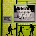
 Give a Cheer
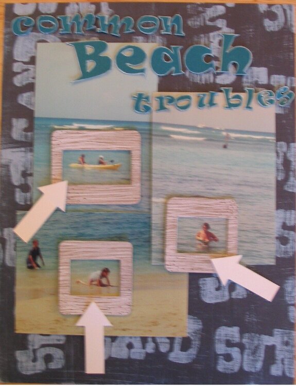
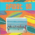
Sorry for the stinky photo of the LO - nothing is tacked down, so I can't put it on the scanner. I need some ideas for the bottom center-right side. I hate to cover up ALL the Sand-Surf paper, but I can't really put vellum there because the bottom picture sticks out too far. But if I crop the pic, it's going to look all wonky.
Also, the 'troubles' will be straightened out IRL and sit entirely in the top of that photo.
The arrows will say : Lost Paddle; Lost swimsuit; and (maybe) Lost cookies (my sister got knocked over by a wave, but it looks like she's puking: would Lost Balance be better? Or something else?)
No products have been added to this project.
Thanks for spreading positivity!


October 07, 2005
September 28, 2005
September 27, 2005
September 26, 2005
September 25, 2005
September 24, 2005
September 24, 2005
September 24, 2005
September 24, 2005
September 24, 2005