FREE Standard Shipping on Orders $69+ with code:
FREESHIPPING

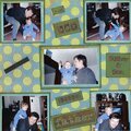
Cheers
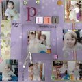
Give a Cheer

 Give a Cheer
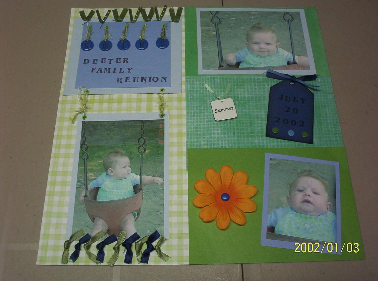
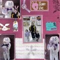
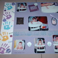
Donald at a family reunion, his favorite thing was this swing!
No products have been added to this project.


Thanks for spreading positivity!


November 13, 2005
November 09, 2005
November 09, 2005
November 09, 2005
November 08, 2005
November 08, 2005
November 08, 2005
October 05, 2005
October 05, 2005
October 05, 2005
October 05, 2005